Python 實現桑基圖(Sankey)
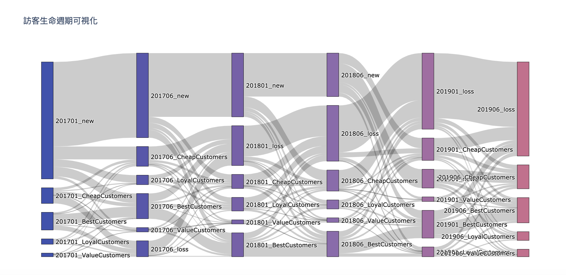
透過上次 RFM 用戶分析模型將訪客分群,用 Python繪出桑基圖(Sankey)將用戶不同時間點分群的變化,用來觀察整體訪客經營是否符合預期中的變化。
桑基圖 (Sankey Diagram)
桑基圖是一種流程圖,其資訊包含著流量的大小、方向及變化狀況,套用在不同階段的客戶分群上,可以簡單看出訪客的變化狀況。
客戶分群意義
接續 RFM 用戶分析模型的分組,避免維度太多只使用 Frequency 與 Monetary 分成 4 組。
| Frequency 頻率 | Monetary 金額 | 客戶分群 |
|---|---|---|
| 高 | 高 | Best Customers |
| 高 | 低 | Value Customers |
| 低 | 高 | Loyal Customers |
| 低 | 低 | Cheap Customers |
實作
分群步驟參照前一篇 RFM 用戶分析模型。
資料準備
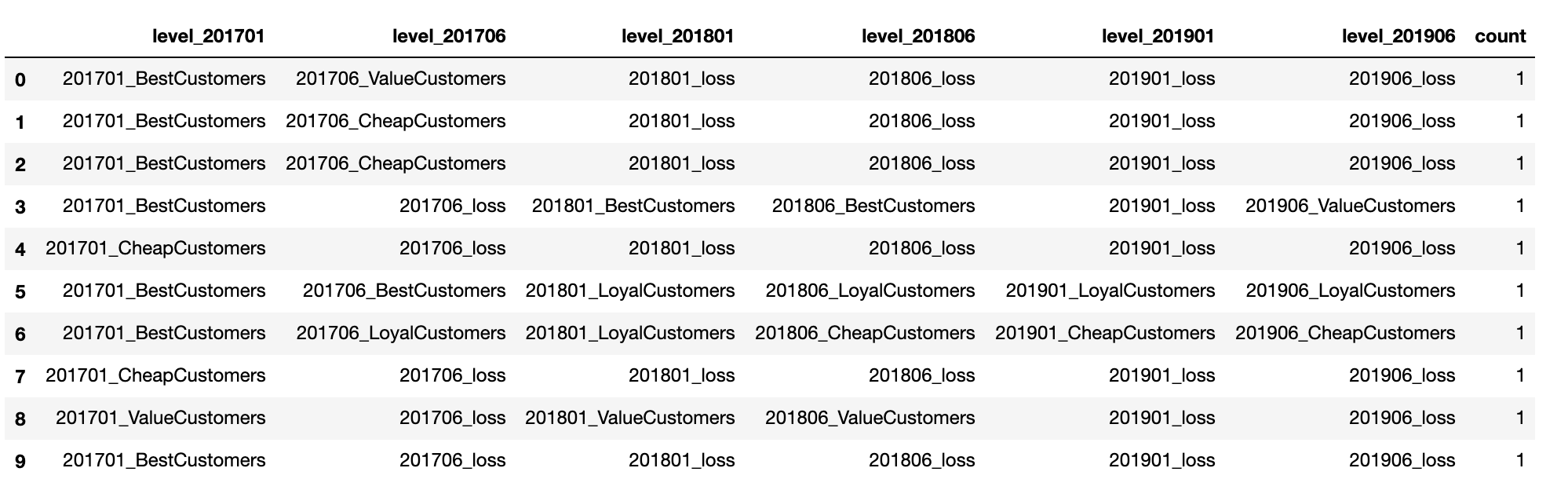
Sankey 圖基本上由 source, target, value 組成,其資訊包含著流動方向與流量值。下圖為這次準備的數據集,其包含客戶每半年的分群與數量。
繪圖
函數
def gen_sankey(df, cat_cols=[], value_cols='', title='Sankey Diagram'):
    """ 生成 Sankey fig 物件

    :param df: 資料 DataFrame
    :param cat_cols: 流程中的級別欄位名稱
    :param value_cols: 每個流程的數量欄位名稱
    :param title: Sankey 標題名稱
    :return: dict() sankey data
    """
    # 漸層色
    colorPalette = ['#3f51b1', '#5a55ae', '#7b5fac', '#8f6aae', '#a86aa4', '#cc6b8e', '#f18271', '#f3a469', '#f7c978']
    labelList = []
    colorNumList = []
    for catCol in cat_cols:
        labelListTemp = list(df[catCol].unique())
        colorNumList.append(len(labelListTemp))
        labelList.extend(labelListTemp)

    # labelList 去除重複
    labelList = list(dict.fromkeys(labelList))

    # 根據層級定義顏色
    colorList = []
    for idx, colorNum in enumerate(colorNumList):
        colorList = colorList + [colorPalette[idx]]*colorNum

    # DataFrame 轉換成 source -> target
    sourceTargetDf = pd.DataFrame(columns=['source', 'target', 'count'])
    for i in range(len(cat_cols)-1):
        tempDf = df[[cat_cols[i], cat_cols[i+1], value_cols]]
        tempDf.columns = ['source', 'target', 'count']
        sourceTargetDf = pd.concat([sourceTargetDf, tempDf])
        sourceTargetDf = sourceTargetDf.groupby(['source', 'target']).agg({'count': 'sum'}).reset_index()

    # 對 source-target 編譯成 index
    sourceTargetDf['sourceID'] = sourceTargetDf['source'].apply(lambda x: labelList.index(x))
    sourceTargetDf['targetID'] = sourceTargetDf['target'].apply(lambda x: labelList.index(x))

    # 建立 Sankey 圖
    data = dict(
        type='sankey',
        node = dict(
          pad = 15,
          thickness = 20,
          line = dict(
            color = "black",
            width = 0.5
          ),
          label = labelList,
          color = colorList
        ),
        link = dict(
          source = sourceTargetDf['sourceID'],
          target = sourceTargetDf['targetID'],
          value = sourceTargetDf['count']
        )
      )

    layout =  dict(
        title = title,
        font = dict(
          size = 10
        )
    )

    fig = dict(data=[data], layout=layout)
    return fig
函式使用
import plotly
import plotly.graph_objects as go

fig = genSankey(rfm_variety, cat_cols=[
    'level_201701', 'level_201706', 'level_201801',
    'level_201806', 'level_201901', 'level_201906'
    ], value_cols='count', title='訪客生命週期可視化')

# plotly.offline.plot(fig, validate=False) ## 生成 html
go.Figure(fig) ## 繪圖